Verizon
Up is More Campaign
DETAILS:Through Verizon’s member rewards program, ‘Up’, members get—more. More deals, more discounts, more front row tickets, more tech, more accessories… you get the gist.
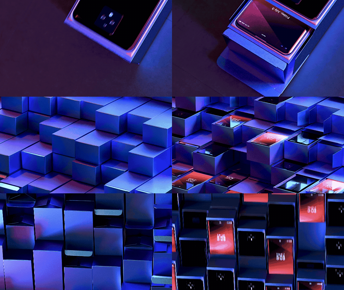
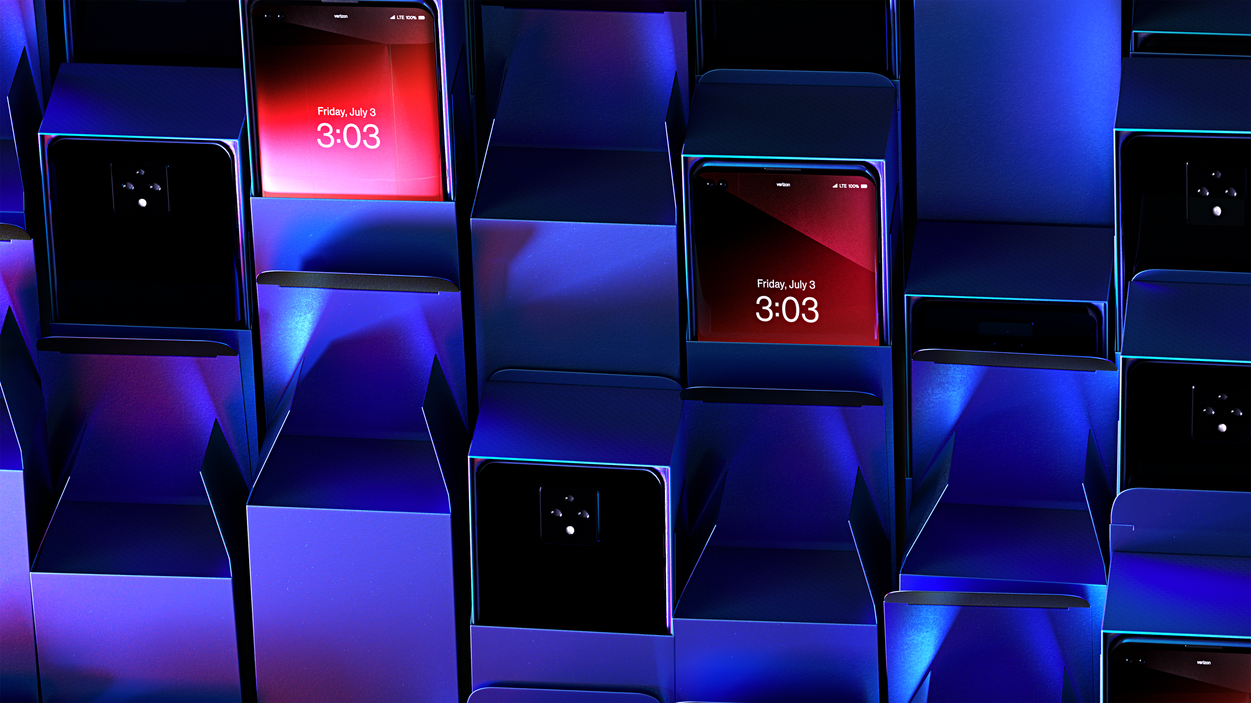
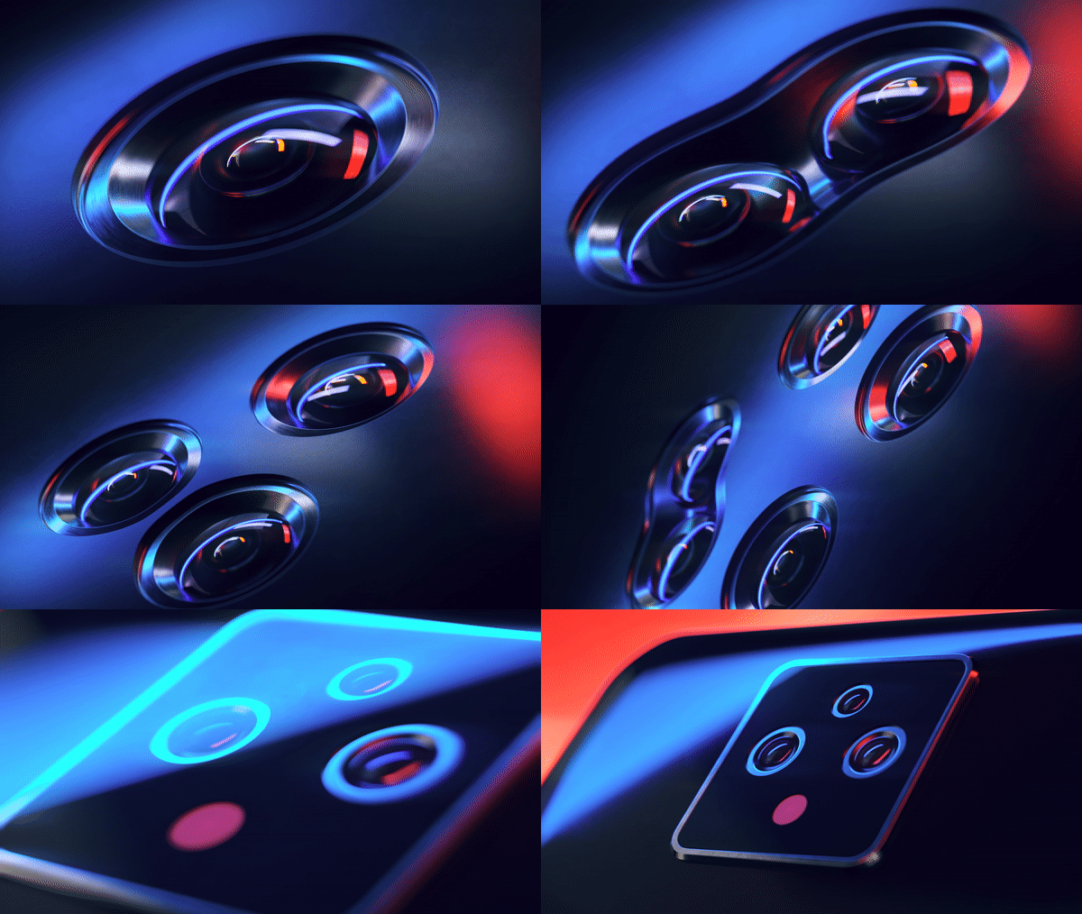
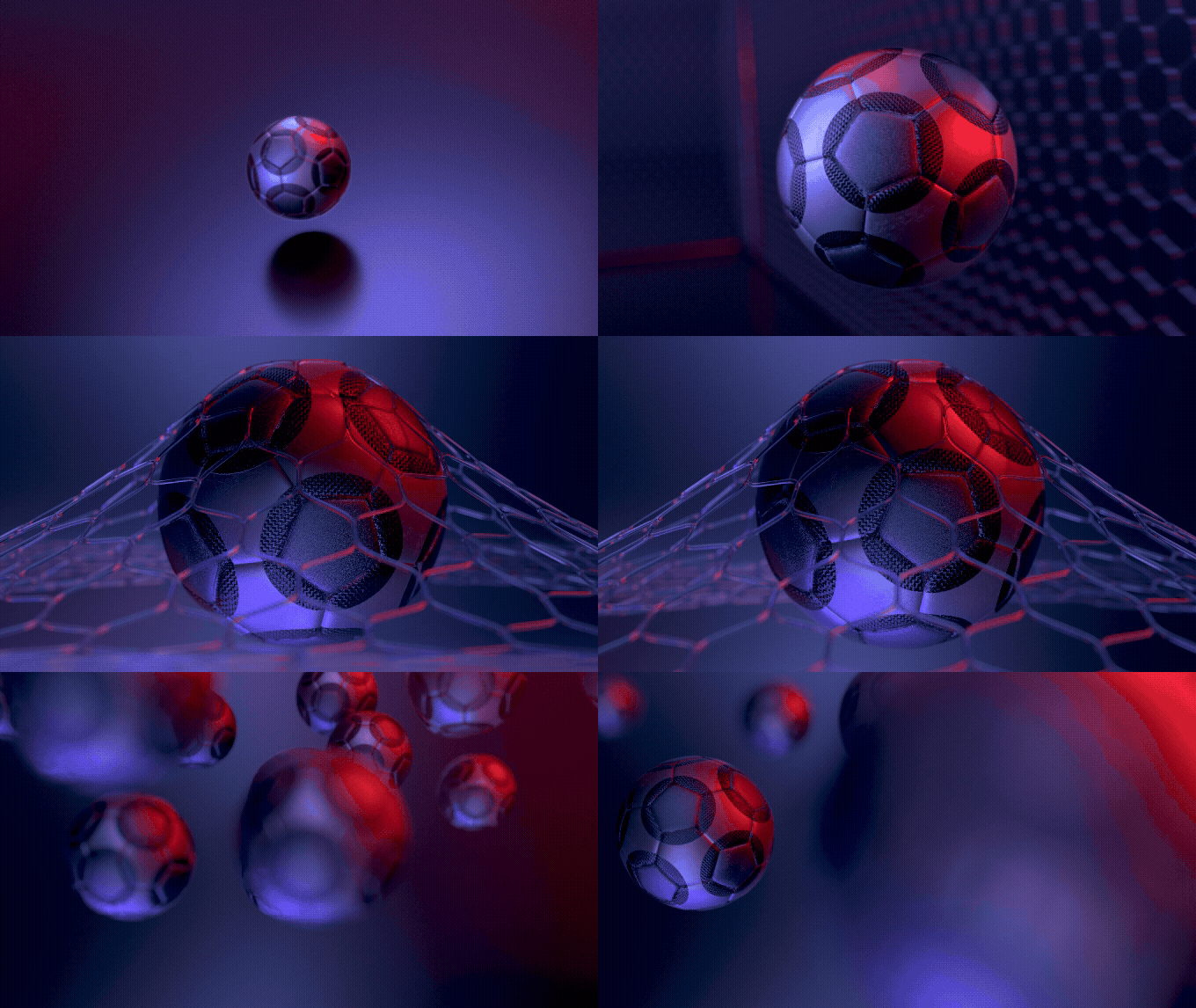
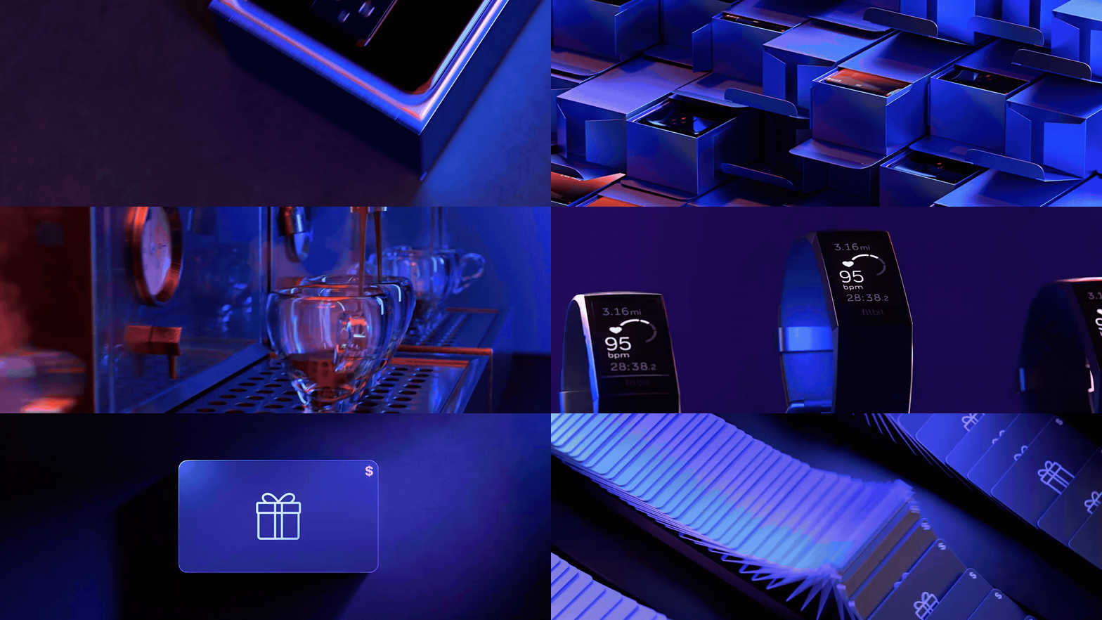
For the reward program’s refresh, we created a never-ending visualization of ‘moreness’. Everything from exploring more color by introducing gradient & iridescent palettes to creating nonstop & perpetual motion in the world of CG animation.
ROLE:Concept
Art Direction
Design
CREDITS:Agency: Verizon 140
Creative Director, Copy: Peter Lee, Ian Going
Creative Director, Art: Ashley Herrin
Sr. Art Director: Chris Bosler
Sr. Producer: Jose Diaz
Sr. CD(s): Tofer Moran, Melissa Avery
Production: ManVsMachine
Imagery + Color:We created more than 20 individual vignettes, each with their own clean transitional breakpoint—thus allowing us to string together a new vignette series to create ongoing content throughout the year.
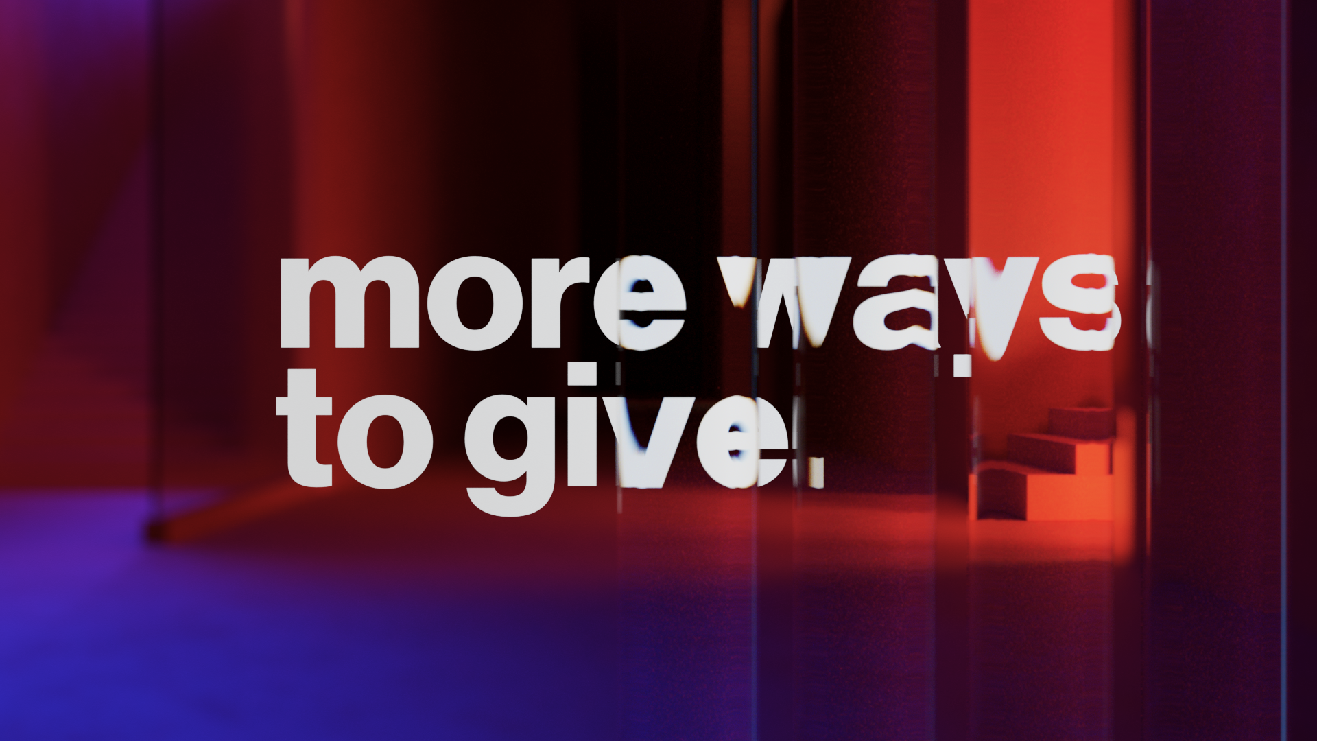
Each vignette had a unique gradient-based color palette. By opening our color palette to a broader spectrum, we were able to ensure each vignette was eye-catching & beautifully vibrant.
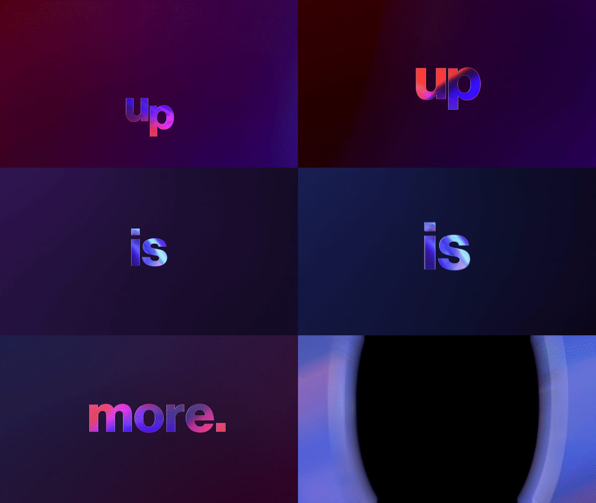
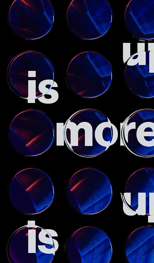
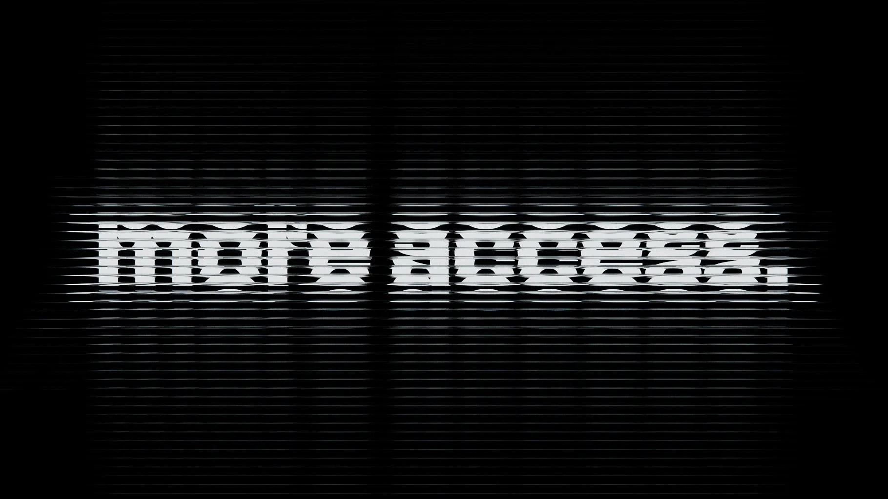
Typography:A huge part of Verizon’s brand DNA is the typography, and how we treated it was of high importance To reinforce the narrative of ‘more’ we used lensing effects and refractive objects to distort, stretch and warp the type and further integrate it into each scene.


